
Designing a Slice of Pie

Infinity Tower, San Francisco, CA
The downtown San Francisco condo my clients bought had all the challenges of a small city apartment, plus a unique one. The high-rise Infinity Tower is an all-glass, clover-shaped structure, with every window and exterior wall curved. It was like designing a slice of pie. The stunning pied à terre was already finished with contemporary floors, cabinets, countertops, appliances and light fixtures.
Our goal was to create an interior design that would soften all the glass and hard surfaces. We wanted to create a sense of spaciousness in this 1300 square foot triangle and introduce my clients’ favorite colors – red, gold and blue.
Balance and Harmony
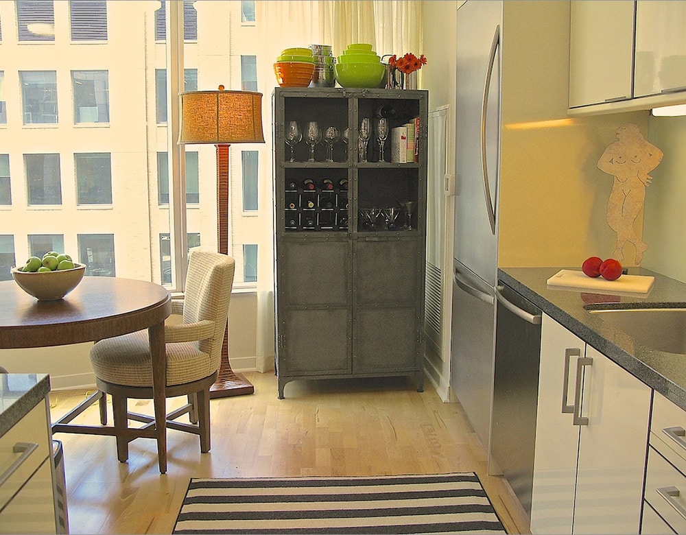
 The kitchen is a great example of how I like to create timeless design by mixing up styles. We found a tall industrial metal cabinet to anchor the window end of the kitchen and provide much needed storage. The vintage piece works among the contemporary elements because it repeats the colors and lines in the appliances, cabinets and counters. This is how you make seemingly disparate styles work together – with common elements.
I also incorporated two of my favorite small-space strategies here. One is to use furniture with legs raised off the floor to extend the visual lines of the room. Another is to visually widen the aisle between the two counters with horizontal stripes in the area rug. To balance all these cool tones and straight lines, we placed a round wooden dining table with tapered legs, two comfy round-back upholstered chairs, and a standing lamp in the eating area. The colors and textures in the upholstery and lampshade provide warmth to the shiny kitchen surfaces, and – lo and behold! –good design repeats itself in the stripes and curves of the tall lamp base. The placement of the metal cabinet elongates the kitchen and makes space for the intimate dining area. When you create balance and harmony, everything works together.
Seven Principles of Art

Good design combines straight and curved lines
I love to put a little drama in the entry of a small space. When you enter the vestibule of this apartment, you are drawn in by the vertical stripes in the rug that direct you to their counterparts in the lamp, whose glow demands your attention to the striking Picasso. Here again, notice how the cabinet’s legs and the open Asian chair provide expanded visual floor and wall space. The chair cushion repeats the black and white theme, as do the framed pictures on the wall to the left. Antique glass decanters on the table echo the reds, golds and blues in the artwork, and all the straight lines are relieved by antique wooden gears hung on the wall to the right. This vignette, though simple, displays a perfect example of how the seven principles of art apply to good design: balance, harmony, composition, color, light, texture and shape.
Small Space Strategies

Large furniture makes small rooms appear more spacious
The living room really threw me a curve. The arc of the glass wall was definitely out of the box, but it’s fun to find new solutions. In a serendipitous bit of luck, my clients’ large, overstuffed sectional fit the space perfectly and mimics the L shape of the buildings outside the window. Starting there, I moved – as always – to the rug, and chose a plush wool hemp in a neutral tone that flows into the wood floor without stopping the eye. In this room, I employed two more small-space strategies, tone-on-tone colors and oversized furniture. I know it sounds counterintuitive to use large pieces of furniture in a small space, but it absolutely works to make the room look and feel more spacious. Color and texture are the stars of this room. Repeating neutrals in the rug, sofa, chair and coffee table visually expands the space. The touches of red, blue and gold combine with black and white accessories add drama and contrast.
Juxtaposing Shape and Color

Vibrant colors provide bold contrast
In the home’s small office, I placed an open desk in front of the window to take in the changing light and soothing architecture of the building across the street. My clients love to sit in the rolling chair and watch the comings and goings below their windows. Even in this tiny room, the overscaled love seat makes the most of the intimate seating alcove and doesn’t overwhelm the room with its neutral, tone-on-tone palette. The shapes and colors in the vibrant painting create a focal point, and are a great contrast to the calm symmetry outside the window.
Tricks to Fool the Eye
Living space can be hard to come by these days in the City by the Bay, whether you buy or rent. But even in small, irregularly shaped rooms, it’s possible to create a sense of spaciousness. Tone-on-tone colors, oversized furniture and raised legs throughout are a few simple tricks to fool the eye. Give these a try and see what a difference it makes.

