Transformation II
Design is thinking made visual.
– Saul Bass
On my morning walk today, I saw a tiny brown shingled cottage laced with colorful strings of triangular-shaped orange flags fluttering in the wind. They were strung between multiple gray metal storey poles that outlined a much larger silhouette of the soon-to-be-remodeled cottage that may ultimately (who knows) become a castle.
As I continued my walk, I counted six remodels in progress along my route. I am crazy about houses, and fantasized as I passed by contractor signs staked in yards what these houses might look like after their transformations.
When I returned to my home office, I realized it’s been six months since my first Transformation blog appeared of Jackie and Paul’s kitchen in Tiburon. I thought it was time for Transformation II of the couple’s dining room, dedicated to those of you who may be dreaming of remodeling your own homes one day.
The Challenge
Jackie and Paul thought about their new dining room for ten years before they actually bit the bullet and started the project. The rectangular living area in the center of their 1960’s tract house was divided into three spaces – a large, landlocked living room, and two small rooms that the couple were using as a library and dining room, all with soaring ceilings to their advantage. Dividing the rooms was a monolithic two-sided brick fireplace that loomed over all three areas, but didn’t relate to any of them, and blocked the view of their private backyard from the living room. The library had large built-in bookcases and the cramped dining room had a small doorway into the kitchen.
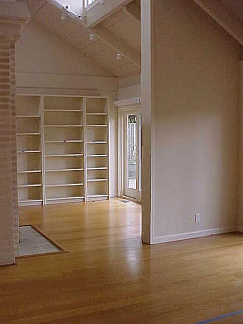
Two Rooms Become One
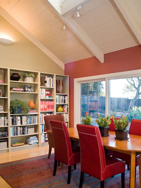
Jackie and Paul both love to cook and had fantasized for years, picturing a crackling fire next to a big dining table surrounded by happy guests enjoying luscious feasts and fabulous wines. But they weren’t quite sure how to create this out of the two small rooms without sacrificing their bookshelves, so they ask me to help with their vision.
“Why not remove the half-wall between the two smaller rooms, and create a combination dining room-library, showcasing your books and memories of your lives together? What better backdrop for a dinner party?” I asked.
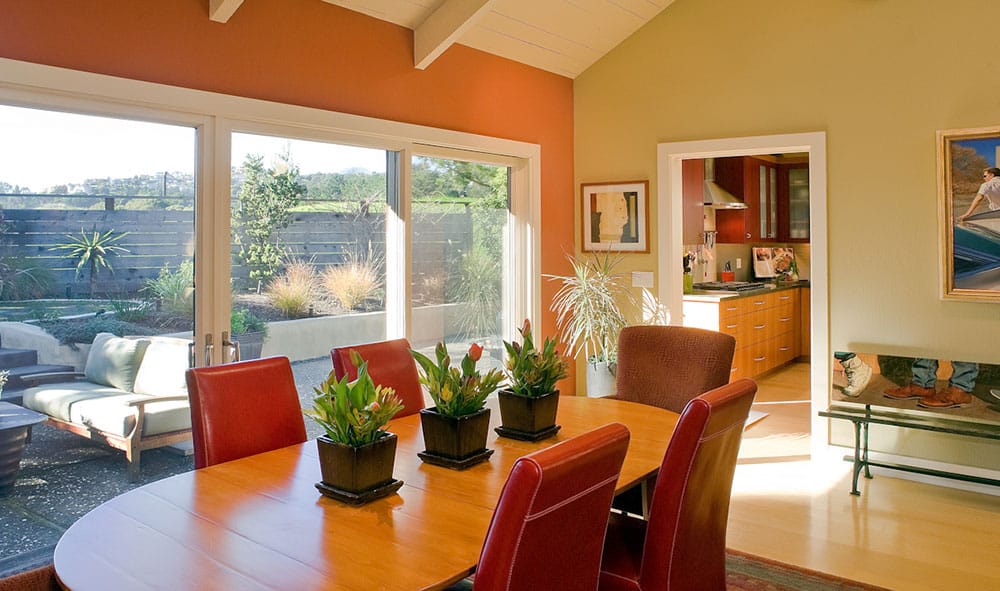
They loved the idea, the wall came down, and the two rooms became one. The scaled-down fireplace (the subject of an upcoming blog) remains as a focal point in the center of the newly coherent space, and provides a seductive place to gather in front of the hearth just as they had imagined. White oak floors replaced the old beige carpet, and the three narrow original sliding doors made way for one large one, opening the entire back wall to the backyard. Ivory walls were painted sage green and persimmon, trim and baseboards were enlarged, and down lights were added over the dining table.
The Finishing Touches
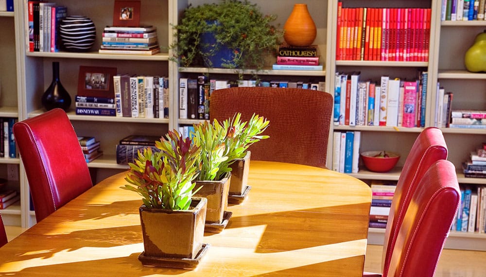
A new contemporary rug anchors the room and reflects the colors on the recently painted walls. The couple kept their previous dining table, adding a few leaves to make it more appropriately sized for the larger space. New chairs were purchased, and artwork and a whimsical hand-painted garden bench from the owners’ collection were put in place. And not to be forgotten, the addition of plants provided wonderful life, color and texture to the room, and enhanced the indoor-outdoor connection.
A New Dream
Remodeling and updating your property can reap big rewards. Years after their remodel, Jackie and Paul decided to escape the crowded Bay Area and move to the Central Coast of California. They sold their transformed home in Tiburon last year – quickly and for a much higher price than they anticipated.
The couple bought five beautiful acres in the Santa Ynez Valley surrounded by lush hillsides, bountiful vineyards, and a fresh egg stand on the corner. They love it, and have begun another transformation of their new three-bedroom ranch home with views of neighboring horses and the Santa Ynez Mountains in the distance.

This home is very different from the Tiburon house and presents its own set of challenges, as all houses do. But that’s part of the adventure of moving to a new place with a new dream.
The Vision
If you are thinking of remodeling your kitchen or dining room or changing any other room in your home, take a lesson from the Saul Bass quote above – Design is thinking made visual. Write down how you want your rooms to look and live, and think about and visualize what you want. Plan to give rooms what they don’t have or remove what you don’t like. And then, when the time is right, go for it.
Remodeling is a wonderful, creative, chaotic, and challenging process, which, yes, can be expensive. But it can also give you great satisfaction, fulfillment, and a new lifestyle. Plus, updating your home can potentially put extra money in the bank should you ultimately sell it. Think about it. And no matter what, I hope all your dreams come true.
Happy almost spring,




An inspiring transformation Linda. I love the blend of colors, and especially the sassy red chairs. The “after” looks like it was original to the design of the house, the way it “should have been”, especially in the way it connects to the outdoors and to the kitchen. I look forward to seeing what you did to the fireplace.
I have enjoyed Linda’s warm color choices and trim selections for years. They create a wonderful, positive atmosphere. Linda Applewhite also uses pattern in a way that draws my eye around the room. Even the artwork is generally composed of many subdivisions of color and pattern. It all becomes more sophisticated with the occasional addition of black. I love the warmth and charm of her compositions.
This blog shows what Linda can do in her very extraordinary way. She celebrates the positive & transforms the negative!
I love the space and the warm color palette that you used and those gorgeous big doors showing the outdoor area is breath taking!! I love all the natural light coming through, what a wonderful place for entertaining family and friends 🙂
It’s so interesting that the colors you chose, are the same colors I have been thinking about for our upcoming kitchen renovation, we are taking down the wall between our kitchen and dining room. I’m so excited, we are working with a designer who will be here some time this week, I could go on and on!! Lol I love all that you do and I can’t wait to see what’s next 🙂
Jean
So Linda. Happy, happy yummy colors. Functional and beautiful. Linda is the master of that. A joy to see.