Catch-up Q&A
Without a good question, a good answer has no place to go.
– Clayton Christenson, Harvard Business School
I’ve been catching up on website comments and e-mails in our last days here in Santa Fe, and I thought this might be a good opportunity to post some of the issues readers have asked me about recently. I love answering your questions, as it gives me a chance to observe and crystalize the ideas and principles I apply to selecting, designing, composing, arranging and creating the elements of beautiful spaces. I hope you can glean some inspiration from these time-tested techniques!
Souvenirs
Q: We like to buy small mementos when we travel and visit friends, but when we get home, I don’t know how to place them where they don’t look cluttered and out of place. What’s the best way to display things so they add to the interior decorating, not detract from it?
A: We all love our collections, and I always like to incorporate my clients’ treasures into the design because it reflects who they are in a very personal way. Objects and artwork that spoke to you enough for you to pay for them and carry or ship them home are even more special as time goes by, as they serve to remind you of the joy of people and moments that might otherwise be forgotten.
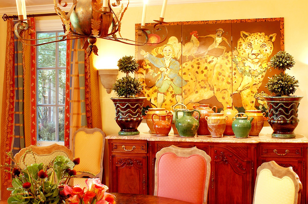
My favorite way to organize a mélange of objects is to place things together that relate to each other in some way. If you have an assortment of teapots, they will make much more of a statement when grouped together on a tray or a shelf than just spread around your home. Often, mismatched and disparate objects comprise the most interesting presentations, as long as there are elements that connect them. Place your treasures together and organize them according to ways they are alike – and they will have common elements since you chose them all – and look for how these objects relate to one another such as similar colors, shapes, or materials that connect them and create harmony.

For example, in the opening photo, child-crafted ceramics are playfully grouped with a pair of ceramic hens and set on a painted wooden tray with a complementary palette. The repetition of the round ceramics is pleasing to the eye, and their curves are repeated in the tray and adjacent bowl of lady apples, lamp base, and flowerpot. The only angle in this homey scene is the white rectangular pedestal under the hens for a bit of contrast.
In my own homes, I have combined treasures from New Mexico and Mexico with pieces from France, Italy, England, Brazil, the Philippines, Spain, China, and Turkey. As often as I could, I contrasted stylistic elements. I combined old with new, rustic with elegant, country with contemporary, oversize with small scale, and sacred with whimsical, as long as they relate to each other in some way. If you have too many items to display at once, try rotating the pieces – maybe once a year on your birthday – and keep the others in a safe place. That way, you’ll always have something new to look at!
Eclectic Harmony
Q: Linda, I love the way your rooms are all so timeless and not trendy and boring like the catalogs. I feel pressured to keep up with decorating styles so my house doesn’t get dated, and I try to follow your advice about only buying what I love. But now I’ve amassed an assortment of things that don’t seem to go together. How do you connect the dots?
A: Thank you so much! I completely agree with you about the power and pull of trends. As a professional in my field, I am continuously exposed to the latest trends in color, style, and materials in the design industry, and I am painfully aware of how quickly trends come and go, creating needless frustration and waste. One of the ways I like to keep décor timeless is to avoid being a slave to a single design trend. Instead, I encourage my clients to commit to their own personal preferences, which often include a variety of styles as their tastes evolve over time.

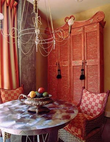
The key here is similar to the one in the first question – harmony. The goal in combining furniture or objects of different genres lies in simultaneously conveying contrast and similarity by repeating one or more elements, such as color, texture, or shape. This produces harmony no matter how different in style the objects are. For example, in the photo above, the furnishings include an antique French armoire, a contemporary ground steel sculptural table, new wicker chairs with geometric print cushions, an antique iron urn filled with vintage pool balls, and an industrial chandelier made from a steel ring with attached exposed wiring. I achieved a harmonious effect in this eclectic vignette by repetition: the cool, neutral gray of the table and concrete pilaster; the vibrant red armoire and fabrics; the vertical lines in the window treatments, pilaster and armoire panels; and the gentle curves in the light fixture, chair backs and pediment.
Upscale Downscale
Q: Linda, what is your trick for furnishing small rooms? I’m redoing a small dining room that needs a rug and furniture, but I don’t want it to look like a city apartment or a dollhouse. What should be small and what should be big?
A: I think scale is a difficult thing for people to determine when they buy furniture – the scale of a sofa or chairs, and how they’re actually going to look in a room. That was a tough thing for me to learn, and I think rugs offer a challenge, too. Rugs define a space. If you want a space to look big, put a big rug in it, and a few big pieces of furniture, but not too much. You won’t believe how big the room looks.
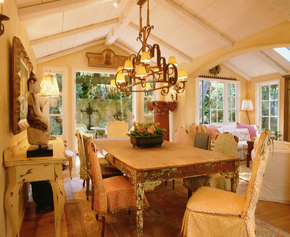
In my former San Rafael, California cottage, we had a 10’ x 12’ dining room. I put down a rug that almost filled the room, and added a 4’ x 8’ painted Mexican table. I was able to open up the ceiling, which enabled me to also install an ornate, oversized chandelier, and I still had room for a narrow buffet. Just be sure your chairs (and legs) fit under the table.

Thank you to all my wonderful readers for allowing my passion for beautiful spaces to enter your homes and gardens! I wish you creativity and inspiration for your projects!
In the love of learning and sharing,


