Blue
As technology continues to race ahead of the human ability to process it all, it is easy to understand why we gravitate to colors that are honest and offer the promise of protection.
– Pantone, about its 2020 Color of the Year
Every year, Pantone, the universally recognized color matching system, announces its Color of the Year. For 2020, they chose their dusky Classic Blue. Leatrice Eiseman, the company’s executive director, describes it as “a solid and dependable blue we can always rely on… evocative of the vast and infinite evening sky… [that] encourages us to look beyond the obvious to expand our thinking; challenging us to think more deeply, increase our perspective and open the flow of communication.”
Quite a tall order for a color, I think, but hey, that is what marketing is for. To be sure, it was a safe choice. Blue ranks as the world’s most popular color in just about every ranking there is.

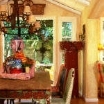
Four French blue leather chairs with ragged orange edges surround my old paint-splattered Mexican dining table. They represent the only objects in my home that are blue because I have always been attracted to warmer colors. That is, until I moved into my old cottage by the sea.

Honor the Site
Although I have helped many clients who live by the water beautify their homes with blues and greens, I was never inclined to do so myself, as the palette was too cool for me. But I learned a lesson from my home by the bay. I realized I need to not only respect its architecture; I need to honor its location as well.
Be Open to Color

When we moved in, I unpacked my beloved yellow quilt with salmon colored palms to place in one of the small upstairs bedrooms overlooking the San Francisco Bay. To my surprise, the deep blue sea objected. The quilt just didn’t look right in the room. Nor did anything else in the boxes labeled “bedding.”
I can’t sleep in a blue bedroom, I thought. But the views out the windows and doors seemed to demand it. Then one day, I spotted a blue quilt with pink roses. I brought it home and threw it on the bed, half hoping it wouldn’t work. To my initial dismay, it did.
The Blue Bed

The next morning, something unexpected happened. I woke up to a view of the blue sky and blue water in the distance with the blue quilt in the foreground. In that moment, I fell in love with the blue quilt with pink roses that happily married the inside and outside as one. The rippled texture of the quilting even seemed to imitate the ripples in the water of the bay.
Next, I noticed how the wrought iron turquoise bed frame I bought years before related to the new tableau. Its curvy lines resonated with the low hills that snaked across the bay, and the greens and blues in the fabric harmonized with the foliage visible through the three sets of windows and French doors.
Warm and Cool Palette

To warm up the palette, I painted the walls the color of pale butter, then placed two cream-colored wingback chairs from a consignment store in opposite corners. For the drapes and shades, I chose a warm, sand-colored fabric with pink flowers that harmonized with the striped bed skirt and rose tones in the quilt.

The tones in the soothing yet inexpensive drapery fabric alluded to both the existing beige carpet and the shades of blue in the water. Pink pillows on the wingbacks tied in the roses on the quilt and the flowers in the drapes and shades. The effect was a mixture of warm and cool tones accented in pink to complement the geraniums on the deck and the colors of the sunsets.
The Magic of Nature

Our goal has always been to remodel this old cottage that has water dripping into the basement, dry rot around the front door, leaks in the roof, perpetually fogged-up windowpanes, and moldy surprises in the walls. Finally, after living here for 20 years, we have saved enough money to make our dreams come true.
We will soon be vacating our aging but still noble Mediterranean doyenne in preparation for her re-beautification, which is about to begin. Gone will be the dated, worn-out carpet, drafty old windows and funky electric floor heater. But it will remain a wondrous place to dream my dreams of a new and better world, with sensual blue tones at my fingertips, beyond my toes and before my eyes.
Create a Dreamy Place to Sleep
I hope all your dreams come true as you surround yourself with the colors, shapes and textures of the site your home occupies and the view from your own backyard. It is truly magical to connect our homes and our lives with nature and to dream a new vision of our world and country.
What colors do you see from your bedroom windows? I hope you can see what is now one of my favorite colors – Classic Blue. May it soothe your soul and spirit in these uncertain times, expand your thinking, increase your perspective, and open your thoughts to change and possibility in this challenging year of 2020.

For the love of blue,


I LOVE your aerie, overlooking San Francisco!! The blue connects well with the soft color on the walls and chairs…
Right now I am in love with Prussian Blue, as it leans green, and warms up the triads I like: i. e. Cad red, cad yellow, Prussian blue for Dk value palette, and Alizarin, cad yellow pale and Prussian.
I also have a warm yellow setting with some blues and rust tones in my small home, also near but without view of water.
Thank you for this post on the new colors! Love your viewpoint and SPIRIT!!
I, too, had furnished our home in the warm colors, which we enjoyed for many years. When we moved to a rural area in Virginia, with 10 acres of woodland and a small stream, I fell in love with the colors of nature and found myself looking much towards green and blue. In the last two or so years I’ve been changing my decor to reflect these and I’m very happy with the transition. And since I’ve always been “passionate about purple”, I’ve tried to incorporate a little of that into the scheme as well. Change is such a hopeful pursuit, isn’t it? p.s. I’d still love to see the painting, with the blue, featured behind your blue fox puppeteer in your “Whimsy” post. My best to you and yours.
Linda, you have reminded me of a lesson I learned a long time ago about living with “over exuberance” or even what I considered mistakes. After living with those “ over exuberances” especially in colors & fabrics, I came to love them just as you did your blue. Thank you for teaching us once again the value of patience & taking a risk or two!
I too have always been gravitating to warm colors, but ready to branch out. I think I have the same fabric as your draperies, on my drapes, chairs and pillow shams in our bedroom. I appreciate your advise and your blogs.
I can’t wait to see what you do with your beauty by the Bay. xx
I love your your rippled blue quilt with pink roses! As you know, I love blue with some warm colors to spice it up. Thank you for sharing!
Thank you
Love. Have similar thing with lagoon and pond.