Casita Alegria in Process
I repeat – change starts in your thoughts.
– Anonymous
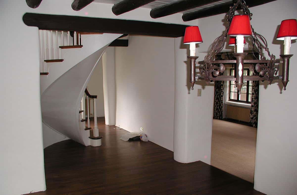
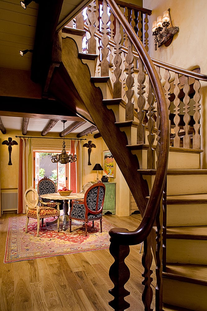
I loved the way Casita Alegria’s chunky chocolate brown lintels defined the adobe’s entryway, where a flamboyant spiral staircase literally floated up to the second floor. But the scrawny spindles that supported the handrail looked like mass-produced, machine-made toothpicks better suited for a crisp cottage in New England than an old adobe in New Mexico. The scale and feeling of the balusters were all wrong. I began to envision what I could do to give the passageway some much needed southwestern joie de vivre.
The Perfect Shape
Unable to sleep one night, I drank coffee while sitting on the floor in my pajamas, surrounded by piles of books on historic New Mexican architecture. After reviewing hundreds of sepia-toned photos of ancient adobes, I turned a final page and saw it – the perfect rustic shape for my stairway balusters that would make Casita Alegria proud of its adobe roots.
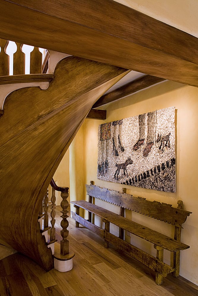
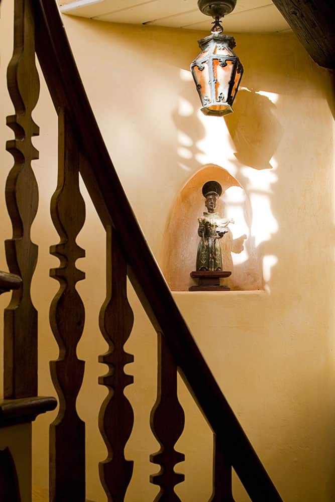
A talented local cabinetmaker fashioned a template to make the traditional stairway supports, which were ultimately topped with an elegant curved handrail. He miraculously fabricated each authentic element out of local piñon wood, just as it might have been done in the sepia photographs. Decorative painter Shawn Man Roland then applied his magic to the existing stairway’s soulless white undercarriage to match the look and color of the brown stained piñon stairway.
Juxtaposition
Lady luck was still with me when I stumbled upon a 10’ long antique Mexican bench complete with scallops in a warehouse south of town. Another unexpected treasure, this one made of newspaper and hemp, beckoned me into the back room of one of Santa Fe’s 150 art galleries. The drama of Danish artist Gugger Petter’s 4’x 8’ artwork, with its textural black and white palette and outrageous contemporary flair, was the perfect juxtaposition to the entry’s engaging regional traditionalism.
An Old Stainless Steel Kitchen
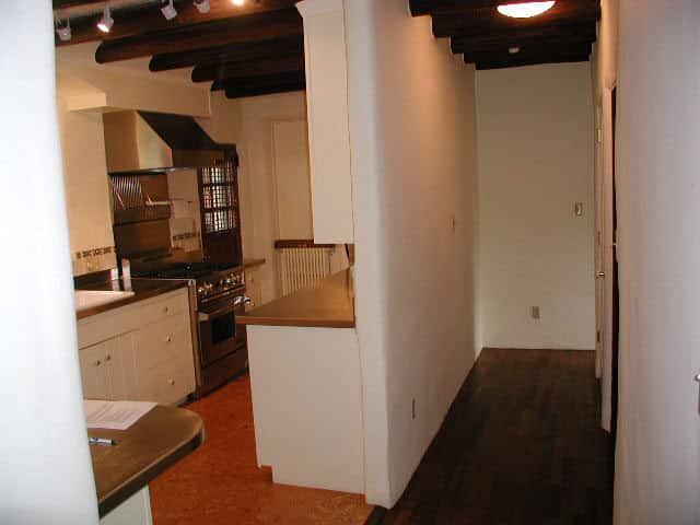
Next, I tackled the tiny, dark kitchen with its dented cork floors, scratched and foggy stainless-steel counters, and ominous-looking black bars on the back door window. The galley kitchen ran parallel to a creepy-looking hallway that led to a small, claustrophobic bathroom.
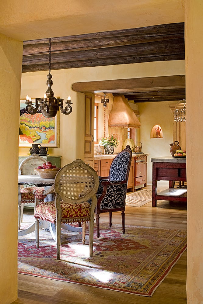
Hallways waste space, so I removed the walls between the kitchen, hallway, dining room, entry, and what I believed to be a family room. The hodge-podge of rooms was now one open space supported by new lintels and a single fat post where the spaces intersected (more on this next week). I installed a second set of French doors in the dining room, and a single French door in the corner of the kitchen without – God forbid – bars. These changes endowed the entire new space with glorious natural light, and I felt I could breathe again.
New Southwest Kitchen
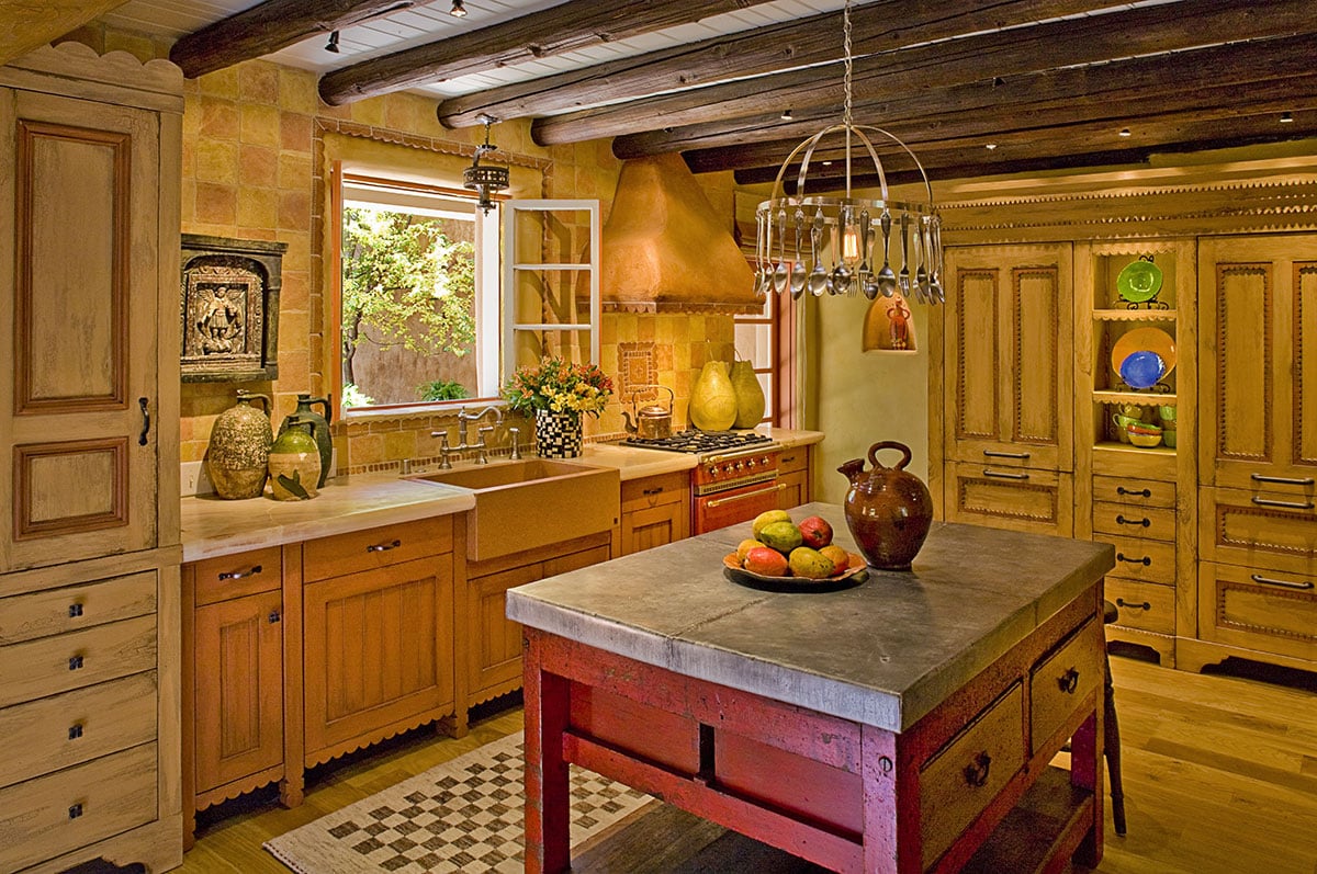
The color palette of the newly expanded kitchen centered around a red enamel stove installed under a stucco hood with concrete scalloped trim on its edges. Six-by-six-inch apricot colored concrete tiles made to emulate antique Mexican pavers covered the wall above the perimeter cabinets. An old, beat-up crimson red rectangular store counter was covered in zinc to cool down the warm tones of the kitchen, and became a center island that served as both a work space and gathering place to entertain guests.
Mystery of the Empty Coffee Cups
We had torn down many of the walls in the adobe and re-plastered those left with new stucco. Shawn and his assistant, Ann, stayed at the casita for several weeks painting and glazing the remaining walls. One day, Shawn called to say a funny thing had happened that morning. He and Ann poured themselves cups of coffee on the kitchen island, and then went upstairs to check a paint color. When they returned, their cups were empty. “Are you sure you didn’t drink the coffee before going up stairs?” “Yes,” both Ann and Shawn affirmed animatedly in unison.
This seemed odd, but I dismissed it until Marshall called a few weeks later with a second unexplained occurrence at Casita Alegria. Hmmmmm…
Come back next week as the mystery of the secret old adobe continues to reveal itself.
For the love of mysterious old adobes,



Wow Linda! Stairway looks incredible. I love that painting with the legs and the dogs did you pick that out? Fantastic work as always
Just beautiful; you have such a great eye and ability to envision. And your use of such colorful adjectives describing the old kitchen made me laugh. Can’t wait to see more of this wonderful restoration and learn the answer to the coffee mystery.
YES! THE COFFEE MYSTERY!!! WHAT COULD IT BE? or, WHO???
Kitchen is amazing.
I always thought you amazingly talented, but WOW you have outdone yourself. This is really beautiful.
Hi Linda! I am a BIG fan of yours. Have been for years. Awhile back, as a decorator, I attended a seminar given by you in Sausalito. I believe it was at held at the Alta Mira Hotel? I learned SO much in such a short period of time. I love your work and especially your blog writings.
This is such a pleasing and livable house. Lovely design choices. I can’t wait to hear more about the house’s mysteries.
Dear Linda,
The adobe is so warm and inviting and that staircase is ah-mazing!! If their are spirits there, I think they were drinking a toast to the new owners, lol or maybe I shouldn’t say that until I read more about the mysteries 🙂 I can’t wait to read more!!
BTW, the contractors have finished the new plumbing and are getting close to to being done with the new wiring. I am so excited about the whole reno of our kitchen, before I know it, my granddaughter and I will be baking cookies again! 🙂
Jean
Oh Linda!! So gorgeous!! Can’t hardly stand it. So so colorful textured artistic AND livable!!
The stairway and hall – absolute genius! Hard to believe that the bottom of the staircase is painted and not actually wood – what a talent Shawn has. What a marvelous transformation, Linda – can’t wait until the next installment!
Bo and Merritt and I were just in Denver and went to the DAM. They have an exhibit of art associated with animals – you need to check it out because your artist – the piece by the staircase – has a piece in the show. We also saw one of her pieces at a gallery in the warehouse district.
Linda, your attention to detail & authenticity is masterful! I saw the original staircase & it’s Cinderella transformation. Outstanding!