The Apartment
Episode One – Thinking Outside the Box
At a time when home has never felt more important, I found myself moving into a dated 70’s-era apartment with stark white walls, ugly soffits, a tacky mirrored fireplace, and cheap black single-pane aluminum windows and doors that shake, buckle and moan when the wind blows.
After vacating our temporarily uninhabitable 1927 home by the Bay, we were grateful to find a clean, mold-free space with a deck and a view where we could live while overseeing our anticipated 16-month remodel. But I had my hands full transforming the 50-year-old ugly duckling into a home that feels good. Although, I must admit, I do like challenges when it comes to beauty.
The Hallway
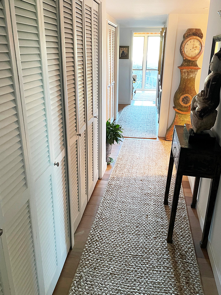
We enter our provisional home through a long, dark hallway with a large window at the end that faces another 70’s apartment building next door. The first thing I did was to find runners to keep Toby from slipping on the hardwood floors, so I ordered inexpensive, neutral-colored jute rugs for the hallways, kitchen and bathrooms. They provided great texture and Toby loves them.
The Windows
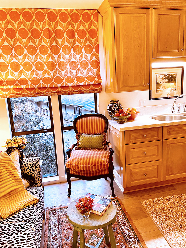
Views not only from the kitchen but also through the dining room window revealed more dowdy apartment buildings with poorly maintained parking structures. So, I tackled the shoddy windows next. I found some playful printed orange linen at a good price and asked my longtime associate, whose sewing workroom makes custom soft goods for my client projects, to construct three large Roman shades for the apartment.
Existing Furniture
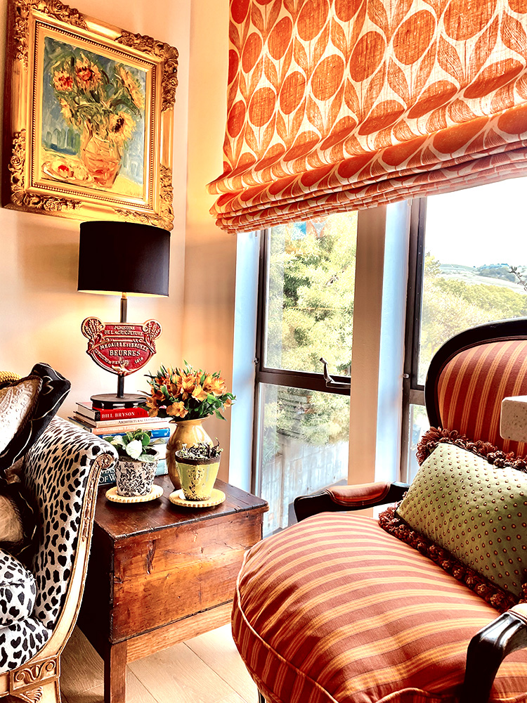
The small space at the end of the kitchen would typically serve as a breakfast area. But thinking outside the box, I visualized the 9′ by 30″ rectangle, with a window on one side and a hallway opening on the other, as an inviting place to relax, talk to the cook and read the morning paper.
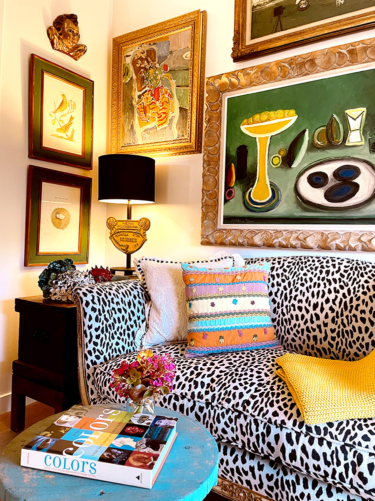
I measured our existing furniture and made a floor plan of what pieces might fit in the tiny niche by the window that brings in the morning light. I had a five-foot-long antique settee in my previous guest room that fit perfectly in the space. I bookended two vintage trunks of varying heights and widths on either side, topping them with a pair of colorful lamps with sophisticated charcoal black shades. Stacks of design and art books elevate the small lamps that illuminate the art above.
Artwork
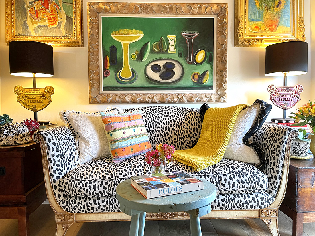
We brought all our artwork to the apartment, putting furniture in place first before selecting pieces to hang on surrounding walls. Above the settee, we hung one of our favorite oils by Spanish artist Navarro Vives – a modern composition of serving pieces, lemons and avocados that shines by the adjacent kitchen.
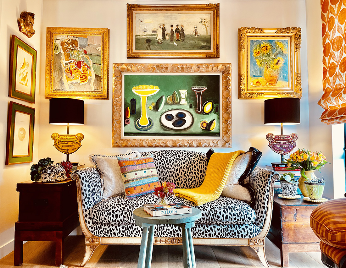
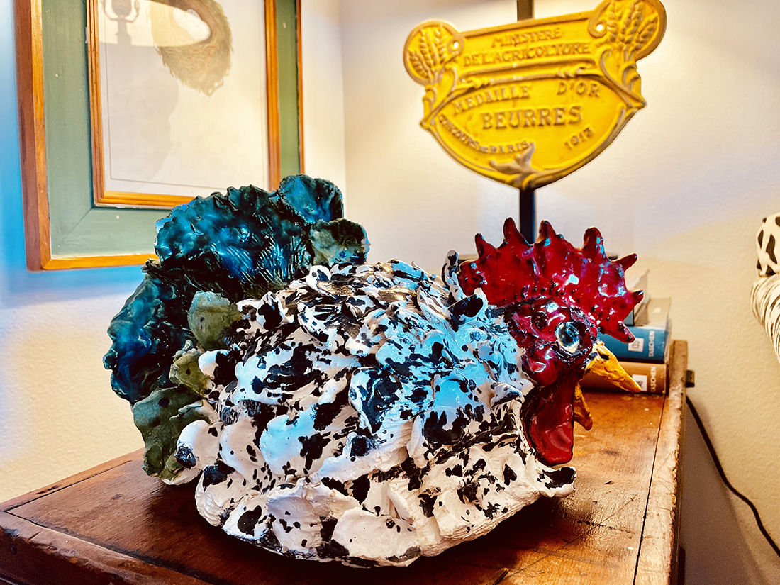
The brightly lit alcove at the end of the kitchen was surprisingly well suited to display a collection of four colorful oil paintings that resonated with one another. A special 18th century carved angel from Colombia glows above antique bird prints, while a glossy black and white speckled rooster sparkles below on one of the quaint old trunks.
A 3’ x 5’ handmade vintage rug in front of the settee clearly defines the alcove space, and the funky turquoise stool that has traveled with me through several moves is now a convenient spot for coffee, books, newspapers and flowers.
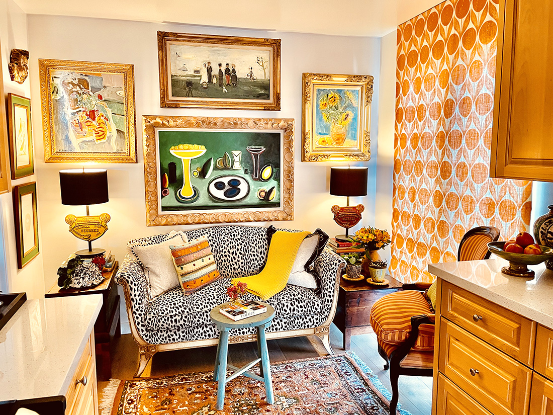
The French antique orange striped chair by the window offers seating for Marshall while we deliberate the status of the remodel or reflect on the news of the world. Sometimes I lower the eight-foot-long shade when it’s too cold or too sunny, creating an even cozier feeling in the small space.
The Kitchen
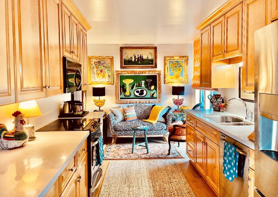
The apartment’s recently remodeled galley kitchen is spacious, and I love preparing food on its 12’ long counters. But I never turn on the harsh florescent lights above. Instead, I placed two small lamps, one on each counter, to provide ample light in addition to the hood and sink lights. Lighting is distinctly important to make a space feel good. Remember, it’s not just about the way a room looks, but the way it feels.
Thinking Outside the Box

Stacking the back and side walls with art and installing a floor- to-ceiling shade on the window makes this small space feel grand yet intimate. Combining black and white tones that absorb and reflect light with vibrant green, yellow, orange, gold, blue and red hues grounds the colorful composition yet makes it pop. This unexpected arrangement repeats colors, shapes, patterns and textures to create harmony that ignites the once-lackluster space to invite you in. This is truly Toby’s and my favorite place to hang out.
The Ugly Duckling
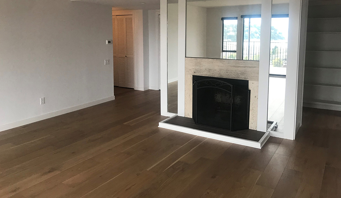
Stay tuned for Episode Two of The Apartment, where I attempt to transform our still-tacky living room into a more inviting space. In creating this five-part series, I hope to inspire those of you who are grappling with boring white walls or other outdated and unsightly traits in your home.
In terms of apartment living in general, I must admit there have been a few surprises. Every night, our high school neighbor upstairs, Michele, practices the Mission Impossible theme on her tuba. And below us, passionate young George repeatedly screams in Greek at the top of his lungs. And we do delight in hearing our neighbors, Olivia and Alberto, speaking in their Australian and Italian accents. But we are most grateful for the stunning ancient oak trees that surround us, where a beautiful family of deer thrives and the lyrical birds who sing from their branches grace our senses.
For the love of ugly ducklings,



Linda- As usual,you create a magical environment. I’m thinking” I should move there”. I am so excited to see all the clever things you have done to make this a warm,inviting home. This is one of your perfect gifts and I’m thankful that we all get to enjoy it.
love love love❤❤❤❤
It’s absolutely gorgeous, beautiful!! You are so talented. Thank You so much for keeping on this email I really enjoyed looking at your amazing transformation of this little apartment!!
Best,
Monica
Ps I’m going to forward to our friend Sandy, she always raves about your wondrous design talent!😉
Yes! Inspiring & gorgeous!
WOW! Love the inviting art and colors…Toby approves! What else matters! Love that we get to come along with you on your new adventure…
Would Love to Hang-Out..there
Beautiful ..Inspiring & so,
YOU ! YEP, TOBY & Marshall,
Too !
You know Lynn I believe you could make any room inviting!! When I look at the view from the kitchen to the sitting area it is so cheery, full of sunshine, joy, humorous, artsy, delightful………just want to be there!!!!!! Like your friend said, You are very CLEVER! Can’t wait for the next blog. Love the picture of Toby!
I love that you are transforming an ordinary place into a Linda Applewhite place! Beautiful. Can’t wait to see the other rooms you home-ify and beautify!
So nice to see how you can take a plain apartment and make it look amazing! What a great example of making a ‘home’ wherever you live. Can’t wait to see more.
Thank you, Linda. There’s no one in the design world who is better at making silk purses out of sows’ ears. What a lively, friendly, colorful space.
This is yet another adjustment in life. It is also a lesson for all of us. Our Heavenly Father gives us what we need-when we need it-and as a bonus, He gives music, entertainment and beauty, and a place for those we love. Comfy, inviting and uplifting to the soul! You are one of His masterpieces. I can hardly wait to see what you do with the living area!
Danelle
Oh Linda, this is a spectacular lesson in how to transform an ordinary space with personal style! I love the settee and chair in the kitchen; a close friend believes in having overstuffed seating and a bookcase in her kitchen and I have many fond memories of conversations there over morning coffee. And I think you could probably do an entire article on fashionably covering hallway floors so aging doggies could navigate on them comfortably – those jute rugs are a fabulous solution without looking like a solution. As always, thank you for inviting us along on your design adventures and hugs to Toby.
Who makes the wonderful fabric on your antique loveseat? The black and white is such a whimsical background for your brilliant display of just enough color!!!
Dear Linda, You are a master story teller! I can see and hear your word images! Greek full volume, Tuba Mission Impossible, accents modulating, birds singing, leaves rustling – a cacophony of background noises – as I sink into the b/w settee to enjoy a warm cup of coffee and snuggle with an adorable pup — I am right there with you. Can’t wait to see what you make of that living room!
Love and hugs to you!
Linda,
What a fabulous job you have done —again.
I was lucky enough to see it before and I am so impressed on what you have accomplished.
What a wonderful Vision you had when you started this project. I am sure that Marshall and Toby was there to help a bit, at least that is what Toby told me……
Looking forward to chapter 2.
Big hug to all three of you❤️
You have such a wonderful way always, putting us in a dreamy state, and imagining how beautiful it is and going to be. Thanks again. Marsha
Absolutely beautiful! thanks for sharing, golda
Oh my goodness! This blog posts illustrates your talent and style very clearly ! I’m so glad you are doing this series!! Possibilities! How to make beautiful the most mundane is spaces! I LOVE this nook and can’t wait for the rest ! 🌞
Ohhh! You did it again! Alcove sooo warm and inviting. I have a small (5′ x 7″) kitchen nook and I receive compliments regarding cozy environment.
I’m with you. Love making something out of nothing. As a former Army brat, Navy wife, have moved many times and always embraced making a house our home. I, too, despise harsh overhead lighting, except for chandeliers, of course. I am a proud lamp and shade enthusiast!
You are amazing and love what you do.
And, yes, there is always light at the end of the tunnel.
A lovely nest you are creating. And the art….ahhh!…and the frames…they are like jewels on beautiful clothing…the perfect complements. Anticipating more of your endeavors.
p.s.-When I saw the title of your post, I thought of the classic gem, The Apartment, with Jack Lemmon (one of my favorite actors) and Shirley MacLaine…lol.
A delightful and cozy retreat. It’s a beautiful and colorful gem . Loving the settee.
Thank you for sharing and inspiring us all in color.
Color brightens everything even in the 7o’s vibe.
Until the next episode color our world.
Love, love, love! When it seems that the whole world decorates with white and neutrals, I so enjoy the joy of color. I can hardly wait to see what you will do with the fireplace.
Love the light and colours. It makes the area so cosy with the furnished you chose.
I’ve said it before and it still stands, you are exceptionally talented and the only interior designer I would have work on my house and it would feel right, like my home, and be beautiful. You are extremely talented, gifted with color, textures, balance. I love your sense of whimsy. What would be a small eating area off the kitchen is better now than with a table and chairs; it’s so charming, warm, welcoming, and cozy. One of my friends called it adorable. Thank you for your fearless and lovely use of color in a gray, white and black interior design world. That sofa is cheerful, the whole room is perfectly curated. There isn’t a misstep. I can imagine sitting there for hours reading, napping, looking at the view of No Cal. I look forward to each phase of the unveiling of the apartment into something visually extraordinary. I’ve decorated many an apartment and never once come close to creating environments, which is your gift. That’s a level above “pretty” rooms. That’s the mark of a seasoned professional with a good eye for design.
Linda,
Thank you greatly for sharing! I cannot believe how beautifully you transformed this apartment from mirrored walls, to rooms with vibrant life. I just liked your Facebook page as and look forward to following your creations throughout the years ahead.
Linda,
What a stunning, inviting and magical space you’ve created. It’s such a reflection of your exuberant, beautiful spirit. And, that picture of Toby is absolutely precious.