
Black, White, Gray with Color
Mere color can speak to the soul in a thousand different ways.
– Oscar Wilde
I rose at six a.m. this past weekend to hike up Frog Rock. What have I gotten myself into, I wondered grumpily. After considering staying in bed, I decided instead to indulge in a fat, steaming cup of Big Bang coffee to help propel me an hour and a half up the Northern California Coast.
Shortly after turning off Highway 101 toward Bodega Bay, I noticed the narrow country road bordered on both sides with sun-bleached gray fences framing saffron-colored wildflowers. Black and white polka-dotted cows – some with red bells around their necks – grazed on effervescent green grass literally fizzing with life and energy.

Combining Neutrals with Color
As I took in the stunning landscape, I reflected on the recent interior design trend that uses a palette of only black, white and gray. Nature rarely does that, I thought, as I relished the vibrant colors mixed with both crisp and fuzzy neutrals outside my window.

I parked at Shell Beach and began my journey on foot to Frog Rock, which loomed in the distance – a big, jagged gray and white hulk. As I followed the path to the beach, I encountered an unexpected cluster of gray stalks standing three feet high with fluffy, bright orange cones on top. The sight of those crazy-looking persimmon-colored flowers against the impossibly blue sea beyond brought a big smile to my face.

Black, White, and Gray with Yellow, Purple and Green
As I walked west toward the ocean, my eyes were drawn to a striking formation of black and gray rocks in all shapes and sizes. Their structures pierced the endless blue water with frothy white foam lapping at their jagged edges. Soft yellow wildflowers spread across the cliffs above, simultaneously contrasting and enhancing the rugged, shiny sea rocks.

Farther down the trail, I spied one wildly brilliant purple iris amid green and gray stems and leaves ringed with tiny furry bronze thistles. Closer to my destination, I came upon a swath of lime green grass dusted with tiny golden wildflowers around the base of the imposing rough gray rock standing before me.

Climbing Frog Rock
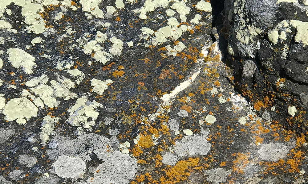
Finally, I began my tentative climb up the 100-foot-high face of Frog Rock. Up close, I was amazed to find the vast grayness alive with stunning color. I was delighted with the mixture of hues as I passed fossilized amber, rust, red, and charcoal fragments beside the gold, gray and white lichen-covered stones that lined the path.


When I reached the top, I spotted brilliant red and green ice plants growing out of the rock’s faded gray color. Sitting on the pinnacle of Frog Rock facing the ocean, I looked down to see the tiniest delicate pink flower emerging from a black rock. I was surprised by nature’s gumption and ingenuity – creating a soft innocent pinkness in the abrupt darkness of a crack.
Nature’s Brilliant Inventiveness
As I drove east from the sea that day, I reflected once again on the flair and inventiveness of Mother Nature as she so perfectly pairs brilliant color with earthy neutrals. I couldn’t help but wonder why the design world so often squanders the opportunity to apply the principles nature teaches us so eloquently.

I don’t adhere to trends. But if you do, and are tiring of your black, white and gray palette, take a tip from nature and consider adding a persimmon, lime green or hot pink pillow or two. You may find yourself loving the liveliness that vibrant color brings to your rooms – and to your soul!
Yours in the beauty of nature,


Lynn what an accomplishment and such a beautiful, energizing, and educational hike. I love the way you show us how nature’s beauty compliments the different colors we take for granted every day. Thank you so much for opening our eyes and making us more aware of the beauty that surrounds us.
One of the cutest faces of color is Toby’s, miss that precious little rascal.
Hugs,
Barbie
As an art major in college many years ago I studied the psychology of color. My personal aesthetic in my home is to use a lot of color, in particular warm spice colors and a lot of Kilim and Dhurrie textiles and colorful pottery. Recently a friend visited me and commented that a hall wall might be too strong a color (burnt orange). Lately I’ve been wondering if the current trend of homes being everything gray (and hard, cold surfaces) might not speak to a general social depression resulting from the overwhelming combination of politics, world trends, technology, crime, etc that seems dehumanizing and sad. There is a possible 16,777,216 number of colors so reports a quick search on the net. Paint companies have progressed to such a point that there are so many beautiful colors available just since the Sixties, even more so recently, so why all the gray? The coldness of a non- color palette and contemporary furniture design looks anti-human. Homes should look inviting and friendly and they used to, but not so much these days. There’s a reason we enjoy the warmth and creativity of Linda’s style.
Right on!! How does anyone live without green??? Thanks as always. Cute Tobes.
Neutrals plus color, what a winning combination! Your eye is so amazing, Linda, to pick up on these lovely details in nature. And Toby, emerging from fluffy white cracks!
Hurrah! Finally someone has stood up to the Restoration Hardware & Pottery Barn black, white & beige syndrome!! Go Linda!
Beautiful. The beauty of nature’s colors and designs for us to enjoy.
Thank you for sharing.
Linda,
Thank you for sharing a wonderful story and that amazing video! I love black & white in my wardrobe but not in our home. I love my earth tone colors, our home is painted and decorated with earth tones. I couldn’t imagine my life without color, I would be so bored!! All of my perennials are blooming right now and that always makes me smile. 🙂
I have good news on the kitchen reno, the contractor will be starting in about a week and the designer ordered the cabinets, counter tops and sink yesterday. Yayyy!!! I picked out the paint colors, cavern clay for the accent wall and dusty olive for the three remaining walls. BTW, that Toby is so darn cute I just want hug him!!! 🙂
Jean
Just beautiful…..your essay, your design philosophy, your photographs, your wonderful little dog. Thank you for sharing.