
Debunking Color Myths
“There is not one blade of grass, there is no color in this world that is not intended to make us rejoice.”
– John Calvin
I am often asked by clients how to begin the process of designing their homes. In my Eye for Beauty e-course coming this fall, I will answer that question with another question: Who are you? What brings you joy? What makes a room not only look good, but feel good to you? To create a space that is meaningful and reflects your heart and soul, it makes sense to first spend a little time in search of those answers.
Look for Color Consistencies in Your Life
Once you start to look, you might just find continuity of color among many of your favorite things. Inspect your clothes, the artwork you’ve collected, your favorite sheets and blankets, the cute dog or cat bed you had to have, your cell phone cover – everything reflects something inside you that has resonance.

Color is one of the central elements of design, and many people have long-held beliefs about it that might narrow their perception of the diverse ways it can suit their needs. They might feel that contemporary design must be all neutrals, or that bold colored walls will make a room look smaller. Or that too much color would be hard to live with.
Do You Know What Colors You Really Love?
When I start a project, the first thing I do is observe and ask questions. I try to determine if what my clients think they should have is indeed what they really want. After a time, a picture emerges to show me (and them) the common threads that flow through their lives, and we can begin looking for the elements that will truly fulfill the vision they have of their home.
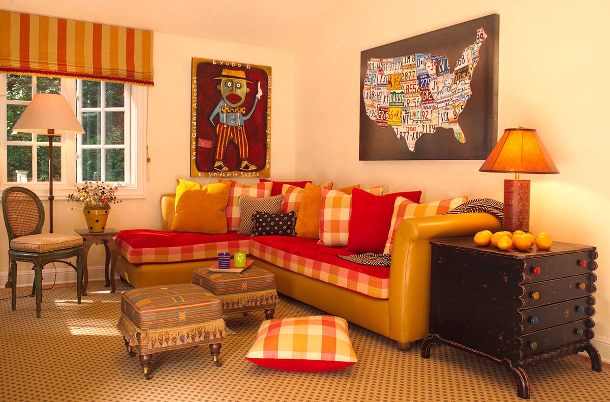
For example, the owners of this four-level residence by the San Francisco Bay wanted all blues and greens to harmonize with the home’s stunning water views. But after living with only cool colors, they discovered they needed warmth.
From the whimsical hand-painted chest of drawers in the living room, we chose a deep shade of burnt orange for the dining room walls – orange is opposite blue on the color wheel. This deep, rich accent restored much-needed warmth, and made the homeowners feel more comfortable in their colorful waterside home.

Don’t Be Afraid of Color
Talk about color! My newly married clients wanted their contemporary home to look like Henri Matisse lived there. They wanted color and lots of it – like a 13’ high blue wall in the living room. We balanced the large expanse of blue with a soft gray ceiling and incorporated orange, yellow and green for a playful feeling. The unusual residents of this sun-filled family home not only ignored current trends, they were not the least bit afraid of living in color.

Vibrant Victorian

In this San Francisco Victorian, the homeowner displayed a distinct preference for blue and white and chose a traditional rug in those colors. She wanted blue tiles on the fireplace as well, so I suggested bringing in tiles with some complementary orange and yellow to warm it up.
The newly painted black mantle grounded all the colors, and created an inviting yet colorful hearthside. My client selected fabrics for surrounding furnishings that not only reflected the vibrant focal point, but beckoned guests to gather in her previously unused living room.
Discover Your Personal Color Palette
I am excited about the exercises I have planned for Eye for Beauty that will use your own insight to guide you toward the discovery of a personal color palette. These experiences will help you avoid the seduction of short-lived fads and instead stay true to yourself and the colors you resonate with.
Color is Nurturing and Healing
Color is very personal and can have healing and nurturing effects. That’s why it’s important to surround yourself with the colors you love. You can learn to trust your instincts and express the essence of who you are, instead of following the herd and being pulled from trend to trend every time the styles change.

When you are living among colors that reflect your essence, you will not only cherish the way your rooms look, but you will love the way they feel. And you’re doing the planet and yourself a favor by moving to a sustainable lifestyle instead of a disposable one. Plus, at the end of the day, wouldn’t you rather come home to your self?
For the love of color,


Color! Can’t live without it! Because of your influence, my bathroom is turquoise, my kitchen is orange and my library is Persian blue. My stairwell is green and my dining area is deep yellow. Most of the colors are on the soft side. They create a cheerful, happy atmosphere very much needed in the Pacific Northwest.
I can’t wait to take the “Eye for Beauty “ e-course! Color is so exciting. Thanks Linda for giving us the courage to go with what we love!!
Linda, I’m with Kirby on this; can’t wait!
Donna, your comment reminded me of a favorite quote by garden writer Ketzel Levine: “I drink purple in the morning and read on lime green. I sleep in smoky blues beneath burnt orange, and I eat in a yellow afterglow. My home is filled with the conversations of color. . . “
My house is full of color and I get many of my ideas from you…..love love your style…. Keep that inspiration coming..