A Pattern of Success
“Through its repeated patterns, nature reminds us of the things that remain constant over time, while also teaching us to be optimistic, and remain open to the unknown.”
– Somali Chakrabarti
In my years of experience working with clients, I have concluded that the thing that most strikes fear into their hearts is choosing and combining patterns. When I present fabrics of various patterns for use in the same space, I see their eyes widen and a look of terror befall their faces. They fear their home will be too busy, or too eclectic, or too bohemian. Their question, whether spoken or silent, is, “Really? Can I put those patterns together?”
One of the lessons I am most excited to offer in my upcoming Eye for Beauty e-course is the module about pattern. I think confidence in our ability to recognize our own sensibilities, tolerance and response to patterns – and distinguish them from the latest trends – may be the most elusive.
Nature Gets it Right
In nature, and therefore in design, there is an infinite number of patterns. Any repeating visual element, whether floral, linear, geometric – even a monochromatic color scheme – can be a pattern. What’s important is what is pleasing to your individual eye.
Nature never gets it wrong, but that doesn’t mean you should have tall, bark-brown columns and a bright green carpet with flowery upholstered furniture in your home. It only means that you can, if that’s what you want.
Discover Your Eye for Pattern
Once you discover the patterns that are attractive to your eye and how to apply a few basic design principles, you will have the insight to bring your own inner Eye for Beauty into your home.
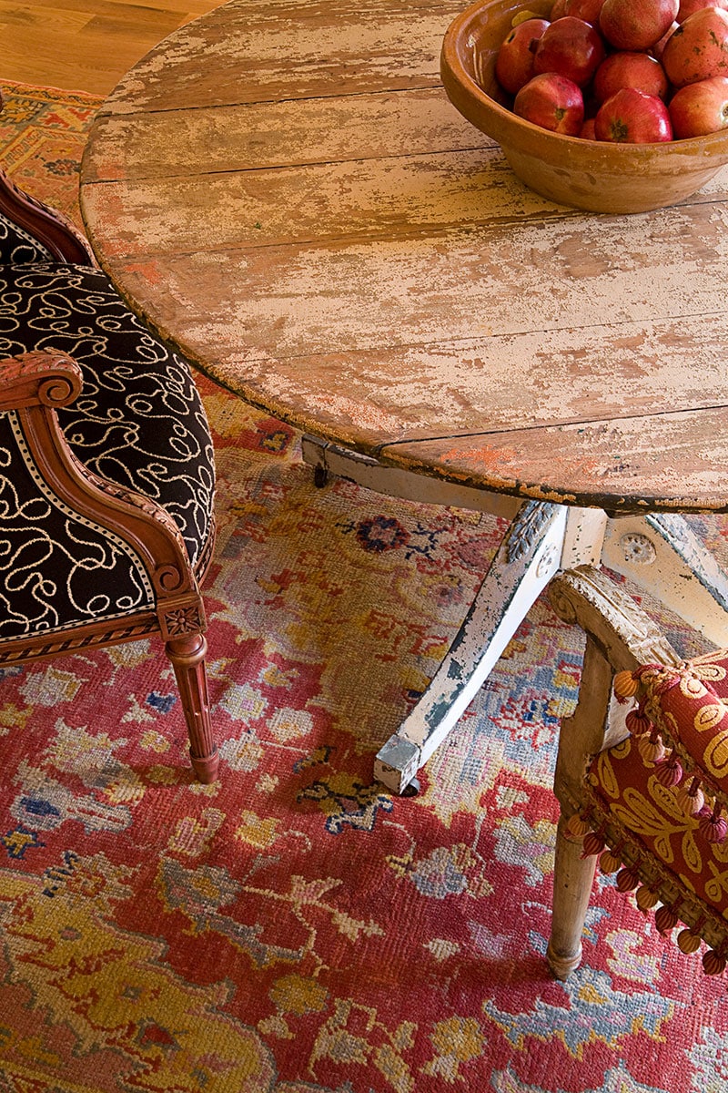
In this Southwestern dining room, the curves of the softly rounded shapes in the rug are repeated in the abstract black and white chair fabric. The red and gold fabric on the chair to the right relates in color to the hues in the antique Oushak rug. The black and white fabric grounds the multitude of colors in the chairs and rug, while the linear planks of the tabletop provide contrast to all the curves, and the blue carved leaf table leg picks up the blue designs in the old rug.
Create Harmony Through Repeating Patterns
One fundamental aspect of design that is often overlooked is that pattern is everywhere – not just in the prints you select for your fabrics. It’s important to consider all the patterns in a space as a complete picture and take advantage of the opportunity to repeat them to create the harmony that will make the disparate elements work together.
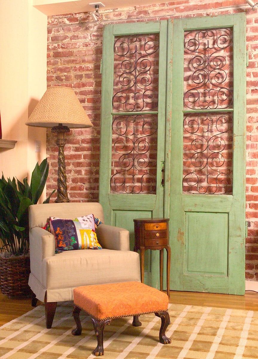
In the photo of this eclectic San Francisco loft, the brick wall creates a strong pattern that is softened by the iron scrollwork in the antique green door panels and the twisty wooden floor lamp. The squares in the rug relate to the linear lines of the brick, and both share a creamy color. Don’t forget that plants display patterns, too, and are great for providing life and texture to a room.
Whimsical Patterns
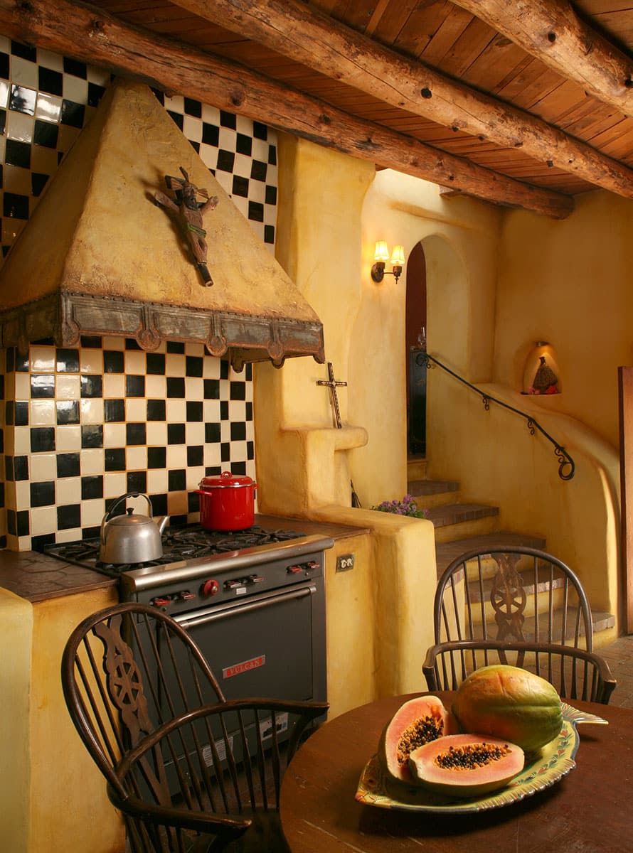
In the kitchen of my friend Kirby Kendrick’s artistic Grade Dame adobe in Santa Fe, we brought the soothing earth-toned palette to life by adding a fun and happy checkerboard tile wall behind her stove. The circular pattern of the rusty metal trim on the range hood contrasts with the linear black and white squares below. And the vertical straight lines of the spindle back chairs relate to the horizontal straight lines of the vigas above supporting the old adobe’s ceiling.
Repeating Pattern Colors
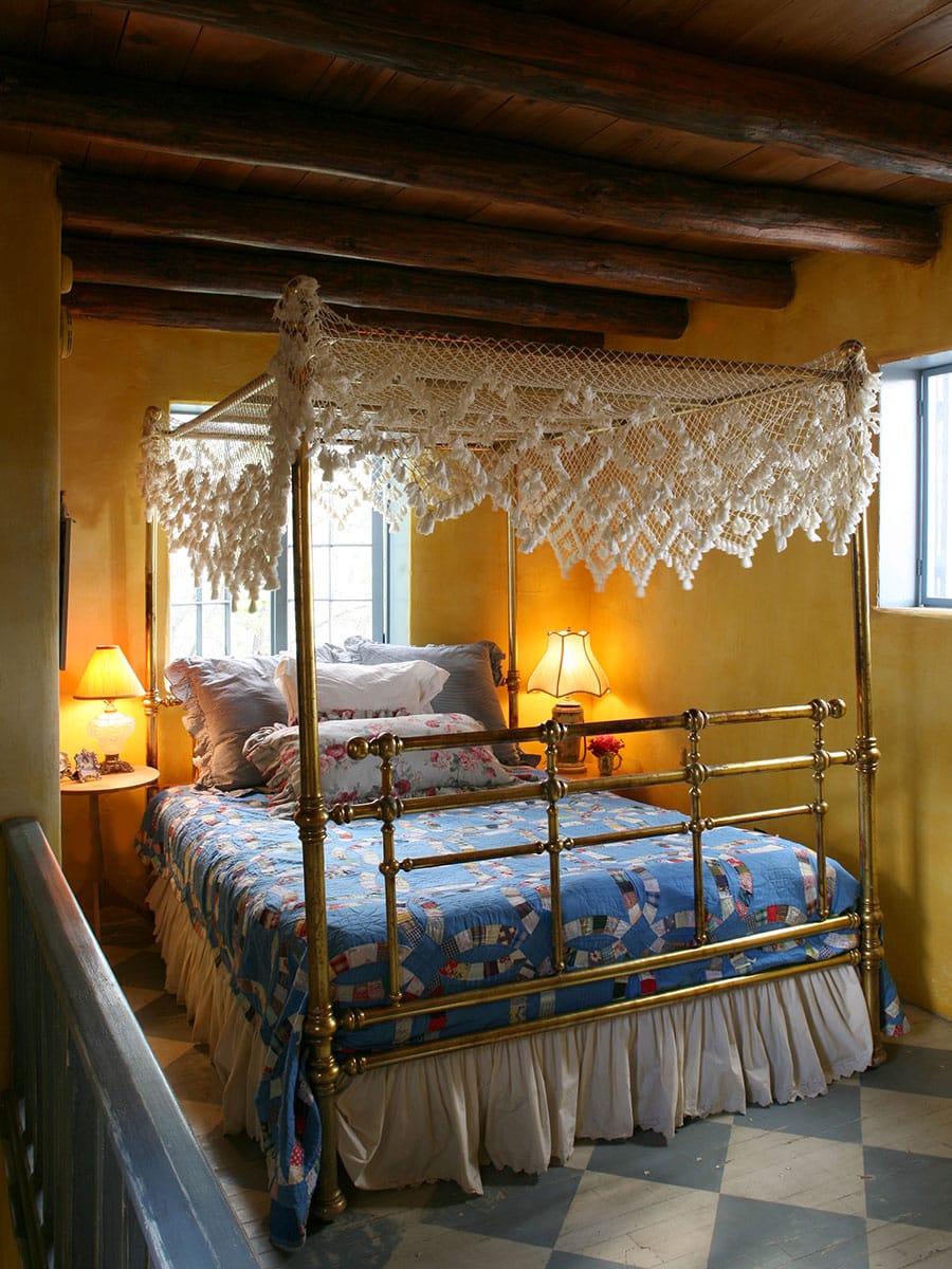
The bedroom of the Grande Dame is a charming example of a simple way to combine patterns by repeating a single element, in this case color. Kirby decided to paint the original wooden floor in large, diagonal blue and white squares. The strong, heavy lines of the timbered ceiling – which is also a pattern – are softened by the lacy white canopy and creamy ruffled bed skirt. The blue squares in the antique quilt with multi-colored borders quietly tie everything together for a relaxing night’s sleep in the high desert.
The Beauty of Combining Patterns
Pattern doesn’t have to be the scary monster that lives under the bed. Once you know how to appreciate its many forms and find your true self in it, you can combine them to your hearts content. Just remember, the principle nature teaches us so eloquently through the spectacular array of patterns it presents is the most basic and important design mantra of all – good design repeats itself!
Yours in the love of pattern,





I love patterns, even after years of decorating new homes and remodels, it still can be overwhelming sometimes. And yes, it is a difficult thing for clients to understand. As always you hit the nail on the head. And I love “ pattern doesn’t have to be the scary monster that lives under the bed”! Great insite as always!
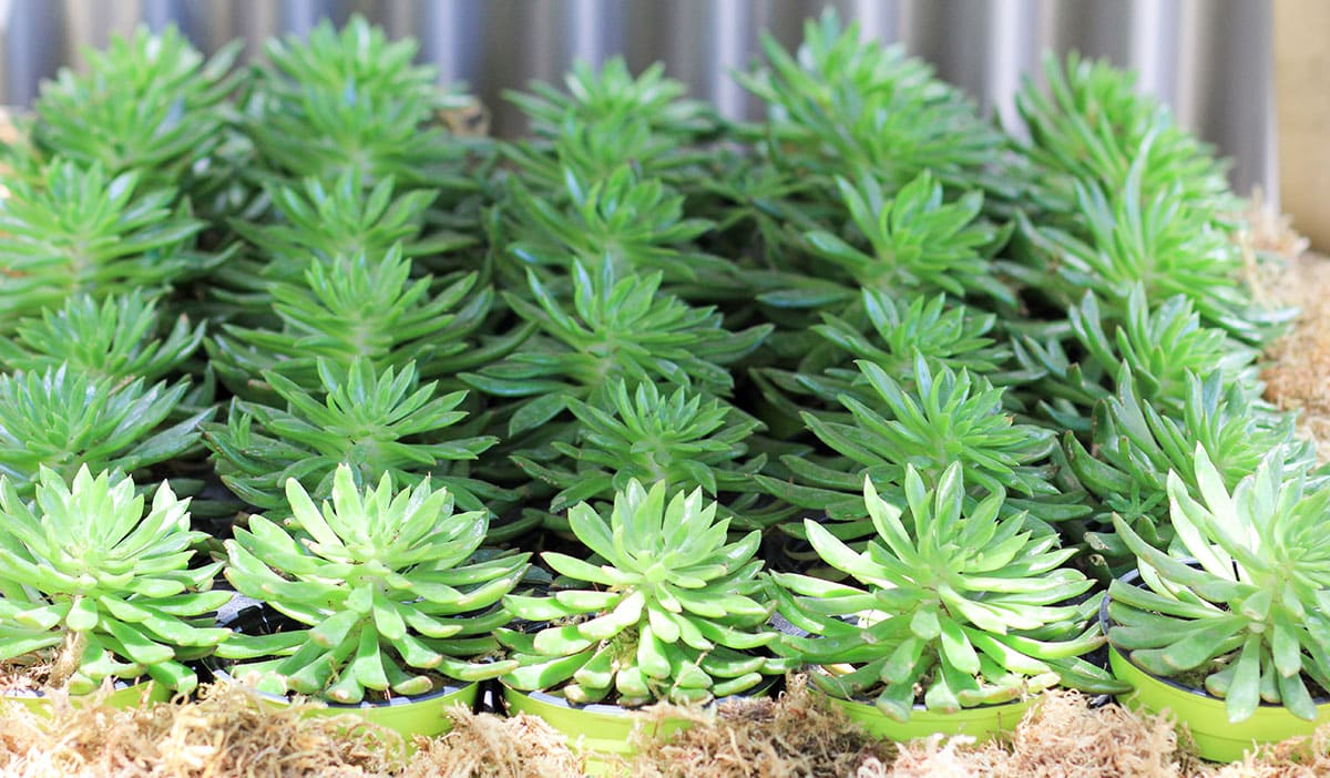
I love patterns too, but the patterns that I love are in straight lines. I love the look of a vineyard with its row after row of loose vines and tendrils, but also the fact that it is uniform row after row (even in the winter when it is just the stalks). The picture that you showed of succulents was really beautiful to me. The succulents make their own pattern with color and leaves, but the fact that they are planted in straight rows makes it even more interesting to me. I guess beauty really is in the eyes of each beholder.
I just read again as this is such a good article. This time it jumped out and I see in repeating patterns in the kitchen, the arch of the chair backs, the arch of the doorway and the niche, edge of the hood design and even the curve in the melons! Beautiful!
Linda, your choice of patterns is fascinating, from a series of sensual curves to a strong set of straight lines and then a mix of the two in Kirby’s kitchen. I learn so much from your posts – thanks for sharing your amazing insights and knowledge. BTW, I’ve been following Kirby’s art blog for a few years – how neat to see her comments and now her home here!