Transformation III
Honor the space between no longer and not yet.
– Nancy Levin
The quote above can apply to many things in life, not the least of which is the process of remodeling homes. You may be at the stage where you no longer want to live in your space as it is, but it is not yet the way you want it to be. This is a perfect opportunity to honor the space between. It can be a fun and creative time during which all the possibilities you can imagine can be endlessly entertaining.
Last week, I featured Jackie and Paul’s dining room remodel, whose between lasted ten years. As seen in the adjacent photo, a monolithic two-sided brick fireplace loomed over the living room, dining room and library, but didn’t relate to anything and blocked the view to and light from the backyard. Jackie, who grew up in New York, describes the original fireplace with her Italian mother’s expression – “it was from hunger”. But she and Paul had the grace to focus primarily on the exceptional things they loved about their property.
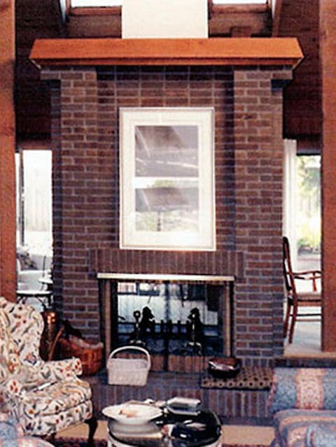
From Dowdy to Edgy
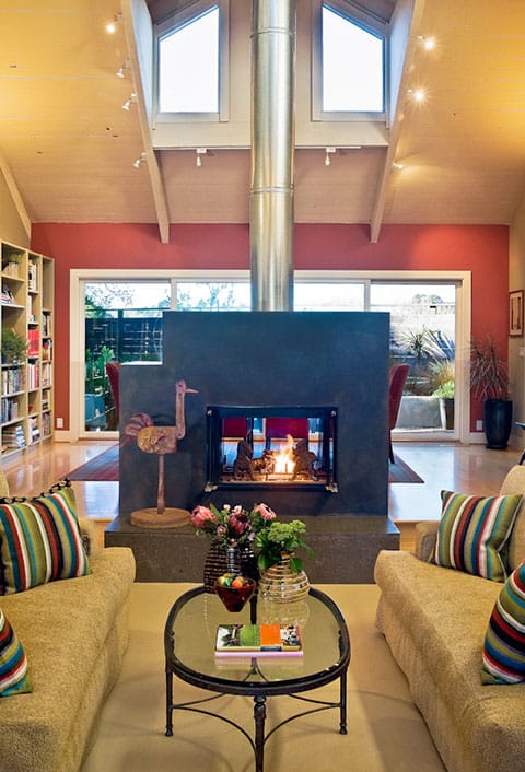
For starters, the house truly had great bones – lofty, painted wide-plank ceilings, clerestory windows, and expansive openings onto a large wrap-around yard that let light into the perimeter living spaces. The remodel transformed the couple’s home from dated, 1960s woodsy traditional to crisp, edgy contemporary. Remarkably, the original architecture lent itself to both styles.
To update the fireplace, we removed the spindly wooden posts on each side, along with the oppressive brick façade, mantle, hearth, and heavy wood trim at the top. Only the original firebox and flue remained.
Lower and Narrower
In its place, I designed an asymmetrical fireplace that looks like charcoal-colored concrete, but was actually framed in plain sheetrock and covered with integral colored plaster. The top left corner is indented above a hidden, spacious firewood niche. We omitted the mantle and covered the old brick hearth with dark gray limestone. I had intended to paint the tall, galvanized metal chimney in red, but when it was finished, I loved the industrial look of it and Jackie and Paul agreed, so we left it as it was.
The result was a much lower, narrower structure that connected the two rooms and outdoor space, but allowed easy access between them. The two-sided fireplace, now centered in the living room and dining room, was perfect for entertaining guests. Wine and appetizers were served on the coffee table in front of the fire, then guests moving to the large dining table behind with an expansive view of the backyard through large sliding doors, still enjoyed the warmth, smell and crackle of the fire.
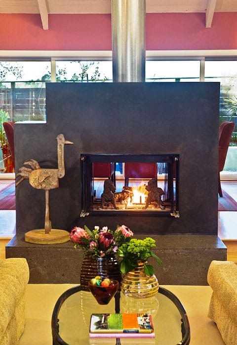
From Isolated to Connected
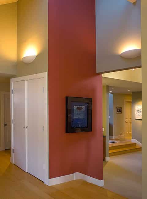
The original living room was isolated from the adjacent family room and kitchen and hardly ever used, and connection to the old dining room and library was impeded by the mammoth fireplace and posts. Although Jackie and Paul had been advised it would be a “huge mistake” to open a passageway between the family room and living room, I disagreed.
We cut a 6′ wide and 5′ deep opening to connect the two rooms, and painted the surrounding walls with bold contrasting colors. The living room was then accessible from the family room and kitchen, and provided an alternate route from those rooms to the foyer and front door. It quickly became a room they used every day.
Red, Gold, Green (and Black)
The newly opened living room held contemporary sofas, chairs, tables and artwork. A favorite antique armoire anchored in the center of the wall opposite the opening served to mix things up a bit, so the room wasn’t too predictable. It also provided a stately display case for a treasured collection of plates, bowls and vessels. The same color scheme of red, gold and green not only enriched the walls, but shone in the living room accessories, enlivening the neutral carpet and sofas.
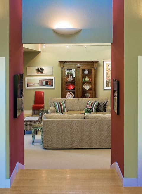
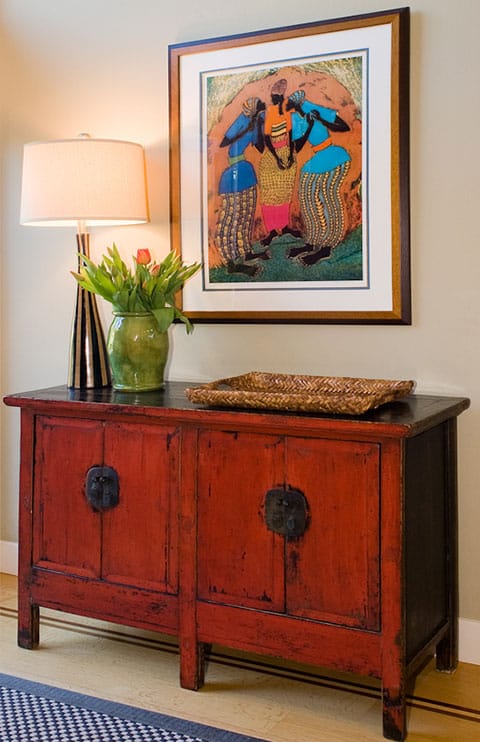
This lively palette was carried throughout the entire house, including in the entry where a vintage red Indonesian chest provides a convenient surface for a woven basket to hold keys and mail. The dramatic blue, green and red artwork above relates in feeling to the chest. Good design repeats itself, as seen in the tall whimsical lamp that emulates the women’s striped trousers. Frequent touches of black ground the bold, colorful palette and give a crisp edginess to the contemporary feeling of the rooms.
Revelations
Even though they waited a decade to transform their home, Jackie and Paul were surprised how quickly they forgot the ugly old “from hunger” fireplace. Jackie said there were some things she and Paul fantasized about but couldn’t ultimately include, such as a big laundry room with a counter for folding. Instead, the washer and dryer ended up in a closet in the family room. They never missed it. The back of a nearby upholstered chair turned out to be a perfect surface for folding, and she could watch TV while doing it. “We adjusted to the wonderful new space we did have and let go of what we didn’t get,” Jackie emphasized.
Honoring the space between no longer and not yet can be a time to enjoy dreaming about your remodel to your heart’s content. But if you’re like most remodelers and not everything on your wish list is possible, you don’t have to feel deprived. There will also be delightful surprises along the way that you never expected. And by all means have fun and let your creativity soar!
Yours in creativity,



Hi Linda,
This was my husband’s house that he bought unfinished in 1969 and had furnished by an interior designer. He sold it in the 1980s and nothing was changed until Jackie and husband bought it. He died many years ago, but would have loved the changes you made, as well as the advice you gave to me in my present house. I enjoy your blogs about decorating. Regards, Sherry
The spaces are so gorgeous!! It’s like they are saying thank you, we can finally breathe 🙂
Jean